blog-WireframesLoveLetter_header-1000x500

Wireframes: Software’s Best Communication Tool

If you say “let’s add a search feature” to a team of five developers, they’ll each have something (wildly) different in their heads. Are results categorized? How are they ranked? Are there ads? What about autocomplete? Should the autocomplete use browser defaults or something custom? Do results get customized for the user’s recent searches or behaviors?

Documentation and requirements help paper over those questions, but there’s a root issue: They use a written medium to describe something complex, interactive, and primarily visual.

Communication is the big problem in software, popping up often in topics we’ve covered. Success is a moving target. Project teams are all unique, leaning on a combination of people, processes, and tools to tackle the problem — but there’s no perfect way forward.

Faced with those issues, what tools are worth using to marry visuals and communication? This article’s title is a bit of a spoiler, but build after build has solidified the humble wireframe as an absolute value engine.

When the budget or schedule is tight, though, many see wireframes as a deliverable worth skipping. They’re never seen by end users, and they put a roadblock in front of design and development getting going. Valid concerns, but short-sighted; as we’ll cover, those intermediary steps are really important for the overall project process.

Let’s take a look at the what and how in a bit more detail.

What is a Wireframe?

In the world of web development, wireframes are a tried-and-true old hat. For those not steeped in our industry, though, the concept is a relative unknown. Stepping back, it’s easy to see why: The name isn’t obvious, their use isn’t consistent, and even we aren’t quite sure of the origin story.

So, what’s a wireframe? It’s a low fidelity mockup; an approximation of an application with simplified details. Something like a quick sketch of a photograph.

It’s tough to know exactly when they became a “thing” for the web. The best approximation points at the early-to-mid 90s and confirms that the name wireframe is borrowed from 3D animation. In the 3D world, wireframes refer to a mesh-like representation of a model — viewing it without textures, shaders, and the like. These are fast to create, faster to edit, and because they lack fine detail, they’re often several orders of magnitude quicker than the final, high-fidelity rendering.

CREATED FROM BLENDER GURU’S TUTORIAL

The Confusing Semantics Around Interface Wireframes

Just like the difference in how five developers would picture a search feature, each person’s idea of a wireframe is a little unique, too. There’s a pretty broad acceptance of just about anything that claims to be a “wireframe.”

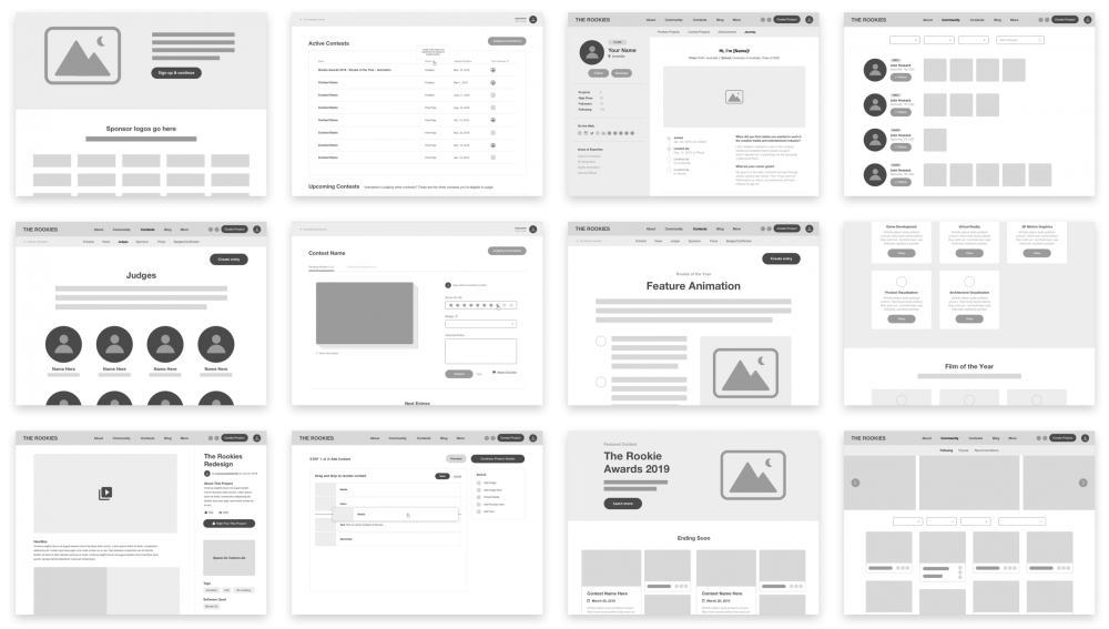
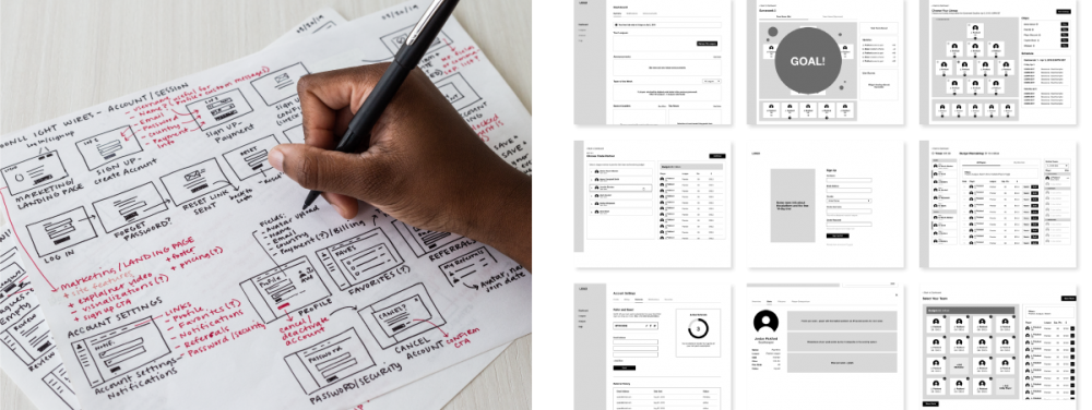
That can include purely hand-drawn elements or digital precision:

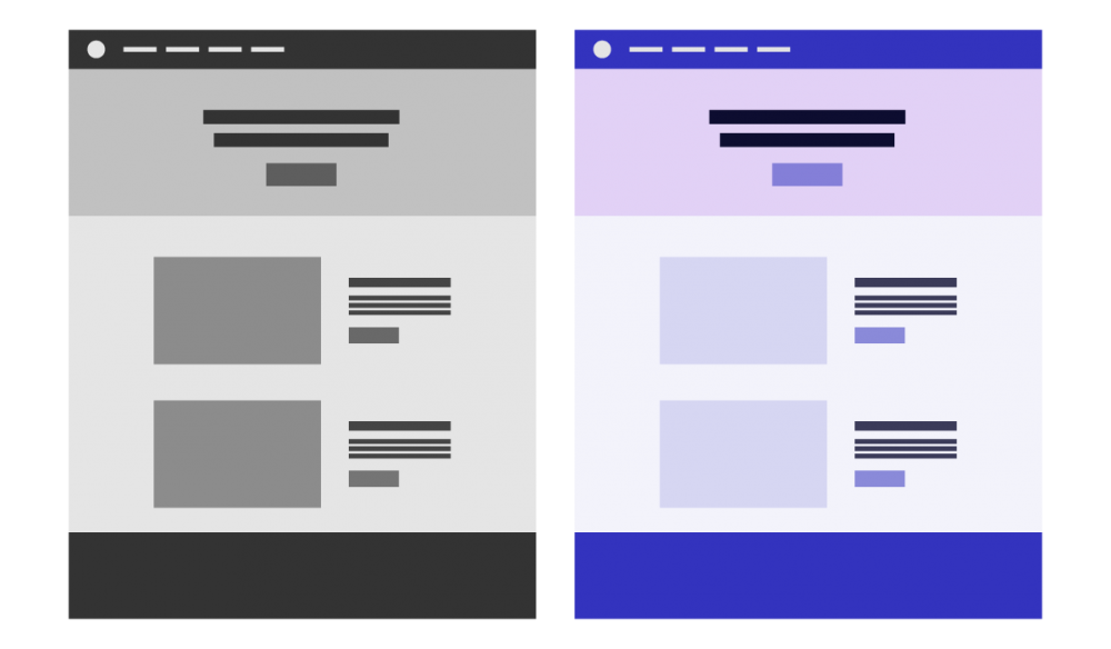
Grayscale or the use of color:

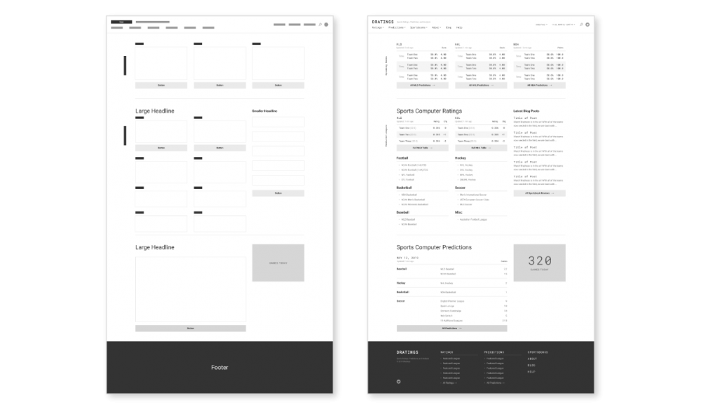
Abstracted details or a thorough look:

And a number of other characteristics on a sliding scale. Interactive or static, fixed or responsive, key features or full compositions, and so forth.

Just to complicate things more,  a wireframe can be whatever a project needs it to be. As we’ll cover from here on out, that extra bit of ambiguity has both positive and negative implications.

The Good Stuff About Wireframes

With history and semantics behind us, here’s a look at some key benefits to support our best communication tool claim.

Fast and Iterative Results

Compared to everything else you could be doing — be it detailed technical writing, full-fledged design, or development — wireframes are faster.

They thrive at the start of a project, where decisions and directions are fluid. If something big can change, your budget will really appreciate the tool that can absorb and reflect a new idea quickly.

Adjustable Fidelity and Cost

As we pointed out in the what section, the level of detail and effort that goes into a wireframe is on a sliding scale. Cost and speed, by extension, are also adjustable.

Have a concept with a ton of complexity that needs a stamp of approval from subject matter experts, legal, and management? Add plenty of detail. Did someone dream up a new feature in the shower that they want to quickly test? Draft up a quick, low-detail wireframe on a napkin.

Project Requirements, Visualized

Like seeing a globe instead of having it described to you, wireframes are the first bridge to a visual product. Requirements become tangible, real features. You’re left with the big picture, and it’s a very different angle than a collection of written ideas and needs.

Spatial (and Responsive) Thinking

Continuing on with the visual theme, wireframes also excel at pulling spatial considerations into the mix. Now we’re confronted by questions like:

  • All things considered, what comes first?
  • With limited room, does this feature make the cut?
  • What action are we primarily incentivizing the user to do?
  • How does this adapt to different screen sizes?

It’s the same concept as a common project discovery tool: The UX Sketching exercise. Participants use a fixed representation of a device screen (so, a box) and are tasked with sketching a specific view, like a dashboard or key page. The addition of layout surfaces important concerns around prioritization, usability, device needs, and information density, among others. In practice, the exercise is a limited, timed example of a wireframe.

A Progressive Stepping Stone

Software is hard to get right, and so is the communication that surrounds it. Anything we can do to make the process predictable is a win.

Hopping from requirements to a completed application (or even a fleshed out design) leaves too much room for surprise, misunderstandings, and the potential to miss the mark. Wireframes sit in the middle of that jump, adding a more comfortable step to expose miscommunications or unknowns along a path to remove risk.

Different Specializations, Same Page

Once we’ve combined the other key benefits, wireframes are the ultimate gut check. Domain experts across the team have a chance to weigh in on whether or not there’s something there worth building — and it’s hard to overstate how much value lives in that checkmark (or lack thereof).

The (Potential) Problems With Wireframes

Nothing comes without costs. The implications and freeform nature of wireframes bring a few potential issues along. As a cautionary exercise, we’ll detail some of the big ones.

Adjustable Fidelity and Cost

Yep, our first negative was also on the list of positives.

There’s a key problem with an ambiguous amount of effort, detail, and cost: Someone has to decide how much, and they won’t always be right. Fortunately, the price for getting it wrong is a good deal less than at later project stages.

If the wireframes go too abstract, you’re effectively kicking the can down the road and forcing the implementation team to handle the details — knocking out many of the key reasons they’re worth creating in the first place.

Filling in the Stylistic Gaps

Wireframes aren’t for everyone. Some folks aren’t practiced or attuned to the concept of looking at grayscale, abstract mockups and imagining what’s missing. It’s like walking through a framed house and trying to picture the materials, finishes, decorations, and furniture.

When this is an issue, creating wireframes for internal use (and critique) is still a worthy use of time.

Finding the Right Owner

As a tool, wireframes seem safe to assign to anyone. Customers won’t see them, they’re quick to change, and they’ll just kick off a number of discussions anyway.

In practice, they’re a specialization unto themselves. It’s a deliverable that marries several skills — covering the basics of design, development, and the subject matter expertise represented to showcase something that’s achievable and in budget. We’ve had the most luck leaning on designers with technical know-how or experienced front-end developers.

A Full Team Commitment

Getting to the sign-off point takes a reasonable portion (10–15% or more) of the project budget, since wireframes spark discussions, changes, estimates, approvals, and meetings. The good news? All of that work saves a boatload of time and money versus getting it wrong later.

Source of Truth or Drawings in the Sand?

When they’re done, should they be updated?

Wrapping up wireframes is a big step, but you’ll have to decide if they’ll be your source of truth from that point forward. If new project decisions are made and ideas diverge, the team needs to be on the same page when it comes to referring back to them.

A Love Letter to Our Favorite Communication Tool

The tried-and-true wireframe: A tool that can’t be overrated. They combine flexibility, speed, and an affinity for change that’s hard to match. They convey priorities, features, and complexities in a way that is both unambiguous and concise.

More than anything, they usually represent the first steps into visually representing an idea. It’s a logical and necessary stepping stone to bring a project team up to speed before diving into costly implementation efforts.

NotInventedHere-Header-Update-1000x500

How Not-Invented-Here Syndrome Affects Technical Direction

The bad news, and the wall every tech leader hits: No platform decisions are clear cut.

Investment capital, the processing power in our pockets, and a few generations of people steeped in technology have all made this software development thing complicated. Even the dusty corners of large applications have hefty requirements around accessibility, performance, responsiveness, and delight.

Despite a ramp up in complexity, many teams adopt the same starting mindset: We’ll build this feature out ourselves. This known psychological bias is usually referred to as not-invented-here syndrome. It’s an inherent distrust in external ideas or ability to execute — sure, someone else tackled it, but we could do better.

Labeled or not, every long-term software project involves decisions made with this not-invented-here bias in mind. Joel Spolsky’s classic article details a few benefits of keeping features in-house, especially as they relate to the Excel team at Microsoft.

At the same time, hefty feature requirements and the number of companies investing in developers has driven the open-source and software-as-a-service ecosystems forward. Like flat-packed furniture, these bits of prepackaged code may not be heirloom quality or match the exact aesthetic you’re going for, but they’re usable in a hurry.

Checklist: Help Determine if You Should Build It or Go Off-The-Shelf

It’s tempting to pull software features off-the-shelf, but there are plenty of circumstances where a bit of wheel reinventing makes a lot of sense. If you can check a few of the following statements with a resounding, “Yes!,” in-house development may be your answer.GET STARTED

Taking advantage of third-party code is easier than ever thanks to package managers and their ecosystems (like NPMYarnHex, and RubyGems, to name a few). Through their automated caretaking of dependency versions, environments, and sub-dependencies, it’s easy to forget just how much code comes from outside your organization.

So, with a feature request queued up, what’s the right approach?

Don’t “Roll Your Own”

It seems simple enough: Your developers are great, so you’ll take advantage of in-house talent to build the feature! Not much to argue against there. At least, until we start to list out to-dos:

  • Build a team. Prioritize this effort and necessary funds over other potential tasks your team could be assigned to.
  • Create a scope. What are the requirements for the first release and metrics for considering this effort complete? Who owns approval? Do decision makers have enough time to commit?
  • Start the long-term roadmap. Since it’s an internal tool, how much time and money will be set aside for ongoing-and-forever future changes and improvements?
  • Build a maintenance team. You likely don’t want your specialized A-team focusing on this forever, so you’ll also need documentation for hand-offs as team members and objectives change.
  • Evangelize it across the company. Does your organization have other applications with a similar need? There’s a compelling argument that they should implement this solution too, which always requires extra considerations and inevitably brings a host of additional requirements.

That’s the short version, but it’s still reminiscent of If You Give a Mouse a Cookie. By opting to own the code, you also own the burden of planning and maintenance. For organizations with tapped development resources or no desire to plan the future of a non-critical feature, the responsibility is a nonstarter. What’s next?

Instead, Use Open-Source Software

As it turns out, other people (and companies) also have some pretty impressive talent, and their open-source contributions amount to a bunch of production-ready code.

Take data visualization. If you’re in need of a few interactive graphs, handling the trigonometry and visual output is onerous; joining the masses and using D3.js sounds like a good move. (Or one of the many libraries built on top of it, like VegaVega-Lite, and nivo.)

Crowdsourced bug reports, testing, security checks, and quality assurance are far more thorough than most companies can match (outside of the largest few). A high contributor count also increases the likelihood of current documentation, release notes, and a focus on regular updates. Often, an open-source library will even come with (free!) functionality beyond the initial need.

Open-source software also brings a pair of ease-of-use benefits along for the ride:

  1. Your new hires may already be familiar. It’s easier to find a React developer than train a fresh developer on your in-house framework.
  2. Installation, version control, and sub-dependency management are all streamlined through the use of package managers. Long-term software project maintenance will rely on keeping these libraries upgraded.

This all sounds pretty great. Is open source the answer?

Wait, Maybe Not Open Source Software

How confident are you in trusting critical business needs to volunteers? Over time, even popular open-source libraries wind up abandoned or fall off the pace of rapidly changing web standards.

Short of being a primary contributor, your company’s lack of a controlling financial stake is also a gamble. Outside code can change direction, goals, features, or become entirely abandoned without room to protest.

You’re also beholden to dangers like:

  • Direction by committee (or everyone in a community).
  • The coding standards of outside developers.
  • Outdated, incomplete, or incorrect documentation.
  • License choice. Can this be used commercially? Is attribution required? Will it require open sourcing all of your proprietary code if you use it?

There’s no shortage of horror stories from the past few years on the open-source + package management front: a copyright claim, a dependency of a dependency having malicious code, and even discord at the parent company.

If the open source approach is suspect, where can we turn?

Instead, Use Software as a Service

If you’re trying to integrate custom maps to your software, there’s a good chance you’ll become a customer of Mapbox. Some things, like satellite tiles and vector mapping, are beyond even the best open-source map providers.

Once you’ve committed to an outside company, they have a financial incentive to keep you satisfied with their service. In trying to stay out in front of open-source options, they often offer some combination of killer features, pristine documentation, or readily-available support. In certain situations, your patronage may even entitle you to feedback on the product roadmap or custom development.

Additionally, with a company-backed service, many potential open-source shortcomings become entitlements: Regular updates, roadmaps, code quality, and communication are assumed to be part of your subscription fee. And better still, there’s now someone else to point at if or when something goes wrong. It all sounds much safer.

Wait, Maybe Not Software as a Service

Nothing underlines the danger of third-party service reliance quite like Killed by Google

Even if the dependency is maintained by an industry leader, there’s nothing guaranteeing it’ll survive long term. Without a look at their books, you’ll never know if they’re stable or a startup floating on venture capital and an unsustainable business model. Acquisitions, acqui-hires, and pivots — these services are often backed by young companies still finding their footing, and there’s danger in how easily digital products can be sold or shut down.

If the service sticks around, you’re still reliant on an outside provider for a critical business need. What sort of price increase will you tolerate? Two costs loom in a replacement effort (pulling it out and creating a new one), and that gives the service a wide berth to adjust fees without losing customers.

Where does that leave us?

Roll Your Own Software Features

Control, direction, cost — a myriad of drawbacks await on the open-source and software as a service side of the fence, so we really should create everything in-house. The benefits speak for themselves:

  • Uptime? You control where it’s hosted and any failover systems.
  • Priorities and roadmap? Whatever you want, paired with your product’s future.
  • License? By you, for you. You can even explore releasing it as open source for recognition or a paid service for future revenue.
  • Maintenance and upgrades? As soon as you need them.

By creating and maintaining the code you need, all of the necessary features live on for as long as they’re required. Seems like a no-brainer.

A Merry-Go-Round of Logic

Those playing along at home probably noticed that we’ve looped back to the beginning. Like everything else in application development, the right path is it dependsUncertainty kinda comes with the territory.

There’s no perfect answer, and the truth probably won’t surprise you: Most projects make use of all of the above.

Sorting Out Build vs. Buy

Not-invented-here syndrome isn’t the enemy it’s made out to be, but it also shouldn’t be the driver for your dependency approach. Software features are a true balancing act, hinging on everything from:

  • Budget
  • Timeline
  • Future plans
  • Developer availability
  • Future plans
  • Alternatives
  • Future plans

And probably future plans, too. From inception to maintenance, every addition to your codebase will need to be weighed and measured.

blog-InteractiveVisualization-header-2-1

Adding Interactivity to Data Visualizations on the Web

The web is a hands-on medium, and that benefit extends (as luck would have it) to the visualizations that live there. Charts in motion give extra context and clarity to a dataset.

Interactivity is a potent tool — when implemented carefully and correctly. At minimum, it adds:

  • Time and cost
  • Complexity
  • Plenty of opportunities to make the end result worse

It’s like the gulf between building a game and taking a photograph. To that end, let’s grab a handful of examples and find ways to navigate around the (potential) shortcomings of interactive visualizations.

Key Ways to Pair Interactivity and Visualization

Where do we start? How do we break a visualization free from a static existence? Whatever you can dream up is probably possible, but an open-ended answer wouldn’t make this a very useful article. Pulling examples from my reference Observable notebook, let’s work through seven of the most common options.

Scatterplot showing the top 20 goal scorers in the 2021–2022 English Premier League season, as of February 25, 2022

We’ll start with a scatter plot that maps the top 20 goal scorers in this season’s English Premier League (as of February 25, 2022). The x-axis denotes total goals, the y-axis shows minutes played, and the leading scorer earns a label on their plot (congrats, Mo Salah).

Changing a Dataset or Variable

The first (and most straightforward) interaction we can introduce is a simple data swap. Here’s what happens if we’d rather see the totals for a different league: Spain’s La Liga.

Animation switching the scatter plot to show the top 20 goal scorers in Spain's La Liga
SWAPPING TO SPAIN’S LA LIGA

Alternatively, instead of switching the entire league, we can change a variable. Here’s the English Premier League with a combined total of goals and assists along the x-axis, where Mo Salah is still in the lead.

Animation changing the scatter plot x-axis from goals to goals + assists
SWAPPING TO GOALS + ASSISTS

Filtering a Dataset

Beyond wholesale swaps, we can tweak displayed data with a series of filters. For our goal scoring example, that could mean adding controls such as:

  • Thresholds for minutes played, like showing players with more than 1000 minutes logged.
  • Time constraints, like limiting the counts to goals after January.
  • Team selection, like members of the top 20 from Liverpool (shown below):
Filtering the scatter plot to show 3 players from Liverpool
FILTERING TO LIVERPOOL

Toggling Extra Visualization Features

Adding supplemental data to a chart can range from useful to distracting, depending on the audience. If a feature is only helpful to some of your target user base, consider hiding it behind a toggle.

On our example chart, we’ll toss in a 1 per 90 reference line: Players under the line roughly average a goal or assist (1) per game played (90 or so minutes), which is an exceptional rate.

Adding a reference line to show the rate at which a player would be averaging one goal or assist per game
UNDER THE LINE = ONE GOAL OR ASSIST PER GAME

Combining or Separating Charts

Our next trick — combination and separation — hinges on how much data we’re trying to show. If the chart is too dense to pick out individual values, separation is a neat trick: We could provide a separate scatter plot for each team, arranged in a grid.

With the quantity of values in our example, combination offers up a quick way to compare datasets. Here’s what happens if we drop both leagues in:

Showing both leagues in the same scatter plot, overlaid
COMBINING BOTH LEAGUES

Changing the Chosen Chart Type

Different visualizations highlight different features of a dataset, as we detailed in an ebook. Our scatter plot is great for showing groupings and outliers, but misses the mark on magnitude and volume. Interactivity can offer both perspectives:

Changing the scatter plot to a bar chart showing the English Premier League leaders in goals scored
SWAPPING TO A BAR CHART

With a bar chart, we miss out on minutes played, but gain a clearer picture of volume for leading players.

Adding Additional Information

The player with the highest x-axis value has been granted the gift of a label, but it stands to reason that users may want to figure out who the other dots represent. Informational panes, tooltips (which we’ll lean on below), and other means of selection can add some exploratory friendliness to a visualization.

Adding tooltips when a user hovers over a plot for more player information]
TOOLTIPS FOR EACH PLOT

Zooming and Changing the Level of Detail

Clustered data can be super useful from a macro level, but actionable insights also rely on the ability to zoom in. Seeing a globe is great, but not if you’re trying to get directions to a restaurant.

Switching gears a bit, here’s a performance audit in Chrome. These charts are invaluable for tuning a website — a lot of loading, processing, painting, rastering, and rendering goes into displaying this page, and the performance audit helps with diagnostics.

Across the top, we can see all of the browser’s actions for a recorded period. To see a specific segment in more detail, we can zoom in (here, the selection is called brushing) and consult the linked charts below as they change:

Brushing a portion of a performance audit, zooming several charts at once
BRUSHING A PERFORMANCE AUDIT

The Shortcomings of Interactive Visualizations

We kicked this article off with some ominous language around being careful and correct. Interactive possibilities in mind, let’s take a look at the key concerns behind all of this.

Assume Interactivity Will Go Unused

Interactivity should come with an assumption: Most users will skip it completely. Dominikus Baur’s article, often quoted in visualization circles (in addition to articles of our own), cites that The New York Times saw only 10–15% of users take advantage of interactive elements.

It’s a strike against the time and effort that goes into interactivity, but follow-up articles have continued to defend benefits like deeper data exploration and overall trust.

Don’t Hide Your Key Insights

Going one step further with unused interactivity: Make sure the chart’s default state tells your story. The scatter plot showing the Premier League doesn’t offer much help if we’re interested in Karim Benzema’s excellent numbers.

Don’t Rely on Hover

Touch devices, densely clustered data, and tiny plots make interacting with individual values awkward. Additional interactive means are typically necessary, like:

  • Swapping to list view
  • Zooming within a cluster
  • Hoverable regions with a Voronoi mesh (as seen in this Nivo example)

Test for Performance

Exploration relies on convenience, and we’ve all abandoned sites that took too long to sort themselves out. Ensure that all of the data swapping, filtering, and feature adding we’ve been covering so far is as snappy as possible.

Tips for Interactive Elements

So, we have interactive visualizations (added carefully and correctly), but what’s next? Here are a few areas to explore and tips to keep in mind.

Split Exploratory and Explanatory with Design

Charts tend to fall into two camps: Exploratory (the examples in this article so far) and explanatory (something like a static executive summary). Beyond one-has-buttons-and-the-other-doesn’t, design cues can help highlight the difference, too. Color palette swaps, different framing or sizing, entry animations, and a host of other tweaks point out graphs with interactive flair.

On the explanatory side, highlighted data is king. As an example, here’s a map detailing the latest in US redistricting on FiveThirtyEight:

A static, small map from FiveThirtyEight detailing the latest with redistricting in the US
A STATIC STATUS MAP

It provides a quick glance at the data, but also serves as a link to their exploratory version. Now, we’re able to toggle maps and drill down on state data:

A large, exploratory version of the US redistricting map
AN INTERACTIVE VERSION FOR EXPLORATION

Pay Close Attention to Axes

Adding motion requires paying extra attention to the chart’s axes. Fitting our reference marks to the current data means we’re pulling the rug out on users when the data changes. Note that when we swapped leagues in previous examples, the x-axis stayed consistent — making it far easier to compare results:

Animation switching the scatter plot to show the top 20 goal scorers in Spain's La Liga
SWAPPING WITH A FIXED AXIS

Animation is Also Information

Animation is a specialized visual language of its own, and its effect on visualization is a field of study unto itself. As a starting point, it helps to track two questions:

  • Does the animation cause confusion? If motion makes data hard to read, that’s a pretty good sign it shouldn’t be there.
  • Does the animation make sense? When the league data switches, our 20 plots could slide to new locations. Those values, though, represent two different players — a more distinct transition is appropriate for what we’re working with.

Add Complexity in Steps

Simplicity is great, but some charts are complex because they need to be. When the right chart is intricate, it helps to introduce features in steps (and with explanations), like this classic Tampa Bay Times report.

Interactivity is a Complex, Medium-Defining Capability

Interactivity is the defining feature of charts on the web, elevating them from images to hubs of exploration. Like most things in a browser, there are drawbacks, trade-offs, and special considerations — equipped with the seven primary means of adding interactivity, though, we’re able to tackle most feature needs.

If you haven’t already taken a peek, visit my D3-powered live notebook with the examples used throughout this article.